Pegs, an experiment in page layout and interaction.
Now that I'm thinking harder about page consumption again, I wanted to surface an old experiment from when I was working on Reader. I'm wondering if a better-executed version of this concept could be useful in an era where site navigation and ads are too easily scrolled off-page? (e.g. IMDB, especially)It seems worth reconsidering ways to optimize content, nowadays.
Demo
The experiment looks like a normal page until the scrollbar is used. Content areas scroll only as high or low as their content.Try out "pegs" by visiting the demo and scrolling up and down.
ex. Screenshot of demo and concept. Two columns, left column doesn't scroll if small enough.
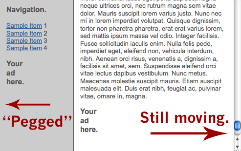
It's a little...odd. Can't tell if I like using it yet. Needs a trial with real content.
Caveats: It's an early work, still. Watch out for bugs.
How this began
Updated this story because I got it wrong. Crud. Better minds and archived emails now help show the important details I should have included.All of us working on Google Reader were looking into ways of making navigation and selection state more visually appealing. Mihai Parparita, tech lead of Reader's frontend, suggested we should have two scrolling areas for navigation and viewing but everyone wanted to figure out a better way than to have multiple scrollbars on a page.
It seemed sad that one scrollbar would interrupt selection state by being placed in the middle. I began work on a demo where the scroll bar would be hidden or at least minimized in some way. I wondered if it could work like the way a differential would work in a car. I began experimenting with just controlling both areas with the scrollwheel in one area only. (In my earlier post, I said I'd thought I'd written my "differential scrolling" notes and script after the left-hand-scrollbar experiment. Nope. That came before, it turns out.)
Kevin Fox (who works now at FriendFeed, don'tcha know), also wanted a better way to scroll. While designing things for Reader, and based on other products he'd been working on (e.g. Calendar), he began considering controlling both areas with the scrollbar in one area only. Kevin and I both came up with early implementations of scroll management. (I should've remembered this - my apologies to Kevin - I'm adding it here so that people know that Reader's awesomeness and experimentation has had many sources.) My experiment used an internal scrolling element to control two areas via a fixed area and a header, Kevin's had a single scrollbar over the whole page with no header. Both were incredibly similar as each area scrolled independently of the other.
I'm pretty sure Kevin came up with the name "Pegs", though we're not sure. :)
Kevin's experiment clearly influenced the development of mine. Right after seeing his, I broke out of thinking in terms of an interior set of elements whose scrolling was determined by a master source, and changed my demo to have the master source be at the document level. Much more interesting. Thank you, Kevin.
At the same Nick Baum (among others) had an idea that any "pegged" approach could be smarter about how it managed the other bar, namely that some logic to when each column would scroll should be length-based. This was a huge improvement.
Days later, during a internal launch road map thread, it was Kevin who first mentioned that having the "Scroll bar on the left is a really interesting idea. <div dir="rtl"> :)" and since that sounded intriguing (and given I'd already finished my scroll-managing object that could do this, too) I made a demo of the left-hand-side insanity and sent it for feedback.
ex. Screenshot of the crazy left-hand version.
Whoops. Everyone agreed: It felt weird and alien to use. (Including Kevin and I.) I went back and modified my original demo with improved logic for scrolling. But we'd moved on... only later did I begin to improve the "Pegs" approach for general use.


9 Comments:
At 11:19 PM, Andy said…
I love it. Worked perfectly for me, and wasn't confusing at all.
At 2:44 AM, Chris Wetherell said…
Hey, Andy! Thanks.
At 6:51 PM, Jay Fienberg said…
That's really great. It makes we wonder whether the horizontal scroll could be engaged in the same way, towards good ends.
Horizontal scroll is generally less useful for a number of reasons, but it could be interesting especially for people who already have joystick type scroll wheels (left-right jogging).
At 7:15 PM, Garoo said…
Great idea, makes perfect sense to use.
Wishing as always that the W3C or WHATWG or, hell, Microsoft would include this kind of behavior in an intelligent column management system on the HTML side, so that we wouldn't have to hack the scrollbars with JS.
As it stands, the navigation column tends to lag and flicker quite unpleasantly with Firefox on my crummy G5; not sure if it can be optimized. For some reason (I didn't look deeply at the source code) it's only the nav bar, not the main contents.
Wonder if you could optimize the performance by just switching divs from position:absolute to position:fixed to stop them scrolling, rather than changing their pixel position with every scroll? Just throwing it out there, not sure how well it could work.
At 7:16 PM, Jesse Ward said…
As an Ex-web designer i never learned how to make a peg page. ( i was a kid who was making web pages as side money to try and buy my first car). IMO (i know its not much) peg pages make a web page look cleaner, more organized, and designed for the user. And thats what ppl want in their web pages; simplicity that is easy on the eyes and easy to use. So i say go for it with one option on the side.
make the peg side fit the contents that is has. dont make it fill the whole page from top to bottom. a bit of white on a web page is smoothing to the eye when the rest is full of graphics and type.
But thats my opinion.
At 12:01 PM, Nó said…
I like it a lot, but i tend to feel that diferential scrolling is only usable when you need to independently scroll different areas, not necessarily limit one or two areas to a third one...
At 10:19 AM, adam nantel said…
The scrolling system on your site is also a little strange. i like to use page up and down to read but I can't here.
Ps the pic of lightning mcqueen is awesome!
At 12:00 AM, Chintan said…
This peg "thingy" did caught my attention on Brizzly. Now I know the name.
Good Stuff!
At 1:48 PM, dunstan said…
Nice. I tried doing the same thing for http://store.apple.com so the shopping cart always stayed on screen when you scrolled down, but I could never get over browser bugs.
Post a Comment